Color Theory in Minimal Photography: A Guide to Elevating Simplicity

Minimalist photography has long been associated with clean lines, negative space, and a monochromatic palette. However, the world of minimalism is not confined to black, white, and gray. Color, when used thoughtfully, can amplify the impact of minimal photography, creating striking visuals that are both simple and emotionally evocative. Let’s explore how color theory can become your secret weapon in crafting minimalist masterpieces.
Why Color in Minimalism?
Minimalism is about focusing on the essentials—removing distractions to highlight the subject. While monochrome often achieves this effortlessly, incorporating color can add depth, mood, and storytelling without compromising the simplicity that defines minimalism. Color can evoke emotion, guide the viewer’s eye, and create balance within the frame, all while staying true to the minimalist aesthetic.
Understanding the Basics of Color Theory
To use color effectively, it’s essential to understand the basics of color theory. At its core, color theory is about how colors interact and the emotions they evoke. Here are some key principles to keep in mind:
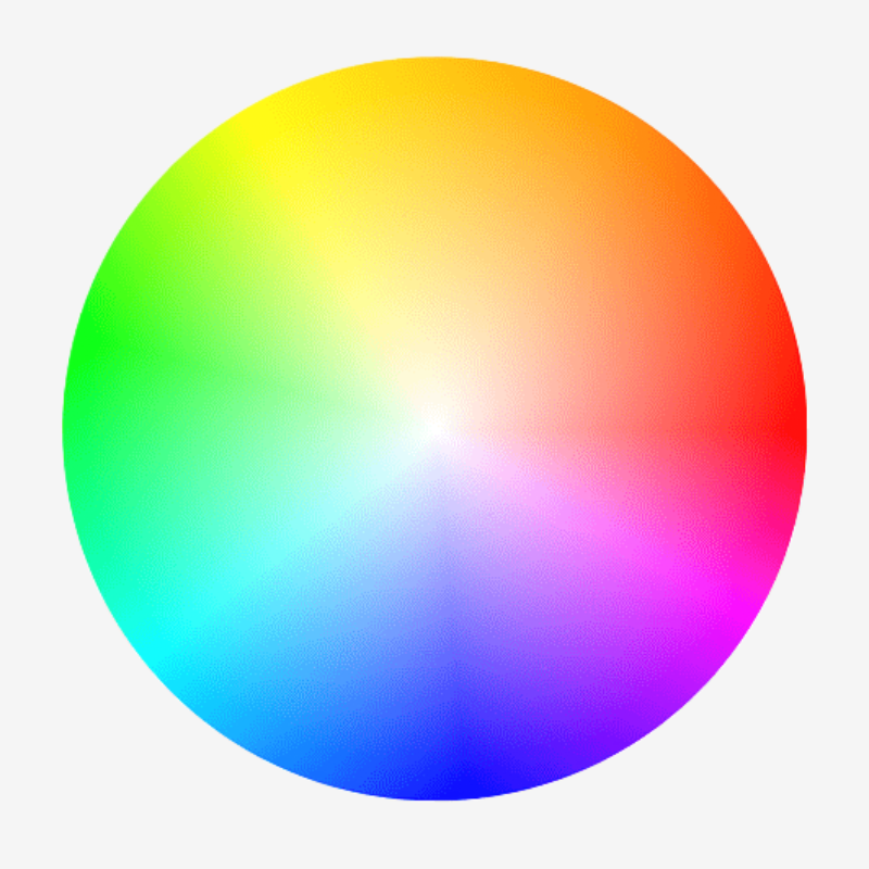
The Color Wheel:
The color wheel is your roadmap. It shows primary (red, blue, yellow), secondary (green, orange, purple), and tertiary colors. Understanding their relationships helps you create harmonious compositions.
Color Harmonies:
Complementary Colors: Opposites on the color wheel (e.g., blue and orange) create striking contrast while maintaining balance.
Analogous Colors: Colors next to each other on the wheel (e.g., green, blue, and teal) create a cohesive, calming effect.
Monochromatic: Variations of a single color can add depth while keeping the palette restrained.
Warm vs. Cool Tones:
Warm tones (reds, oranges, yellows) evoke energy and passion, while cool tones (blues, greens, purples) convey calmness and serenity. Choosing the right tone can set the mood of your photograph.
Saturation and Brightness:
Bold, saturated colors demand attention, while muted tones feel softer and more understated. Minimal photography often benefits from subtle, desaturated hues that blend seamlessly into the composition.
Applying Color Theory to Minimal Photography
Now that we’ve broken down the principles, let’s dive into how you can apply them to your minimalist work:
1. Start with a Purpose
Every color in your frame should have a reason to be there. Ask yourself: What emotion do I want to evoke? What story am I telling? For example, a pop of red in an otherwise neutral composition can symbolize passion or urgency, drawing the viewer’s eye immediately to the subject.
2. Embrace Negative Space
Negative space is a hallmark of minimal photography, and color can enhance it. A bright subject against a muted background creates a sense of isolation and focus. Conversely, a soft pastel subject against a bold background can flip the dynamic, making the background part of the story.
3. Play with Contrast
Contrast is a powerful tool in minimalism. Use complementary colors to create visual tension or stick to analogous tones for a harmonious, serene look. For example, a yellow object on a deep blue backdrop can create a bold and memorable image.
4. Limit Your Palette
Minimalism thrives on simplicity, so avoid overwhelming your frame with too many colors. Stick to one or two dominant hues, supported by neutral tones. This keeps the focus on your subject while maintaining a clean, uncluttered aesthetic.
5. Use Light to Enhance Color
Lighting can dramatically alter how colors appear in your photograph. Soft, diffused light can make colors appear more muted and sophisticated, while harsh light can intensify them. Experiment with different lighting setups to see how they affect the mood and vibrancy of your colors.
Examples of Color in Minimal Photography
The Pop of Red: A single red apple on a white countertop draws attention and creates a sense of focus.
Pastel Perfection: A soft pink wall with a lone green plant evokes calm and simplicity.
High Contrast Drama: A bright yellow chair in a deep blue room creates a bold, graphic statement.
Common Mistakes to Avoid
Overcomplicating the Palette: Too many colors can dilute the minimalist impact. Stick to one or two hues for maximum effect.
Ignoring Context: Colors carry cultural and emotional significance. Be mindful of how different audiences might interpret your choices.
Over-Saturating: Bright, overly saturated colors can feel chaotic. Subtlety often works better in minimal compositions.
Final Thoughts: Color as a Minimalist’s Ally
Incorporating color into minimalist photography doesn’t mean abandoning simplicity—it’s about using color thoughtfully to enhance your images. By understanding and applying color theory, you can create photographs that are not only visually striking but also emotionally resonant. Whether it’s a bold pop of red or a serene palette of pastels, color has the power to elevate your minimalist work to new heights.
So, the next time you pick up your camera, think beyond black and white. Experiment with color, embrace its potential, and watch as your minimalist compositions come to life. After all, simplicity doesn’t mean monotony—it means making every element, including color, count.
What colors will you explore in your next minimalist project? Let us know in the comments below!